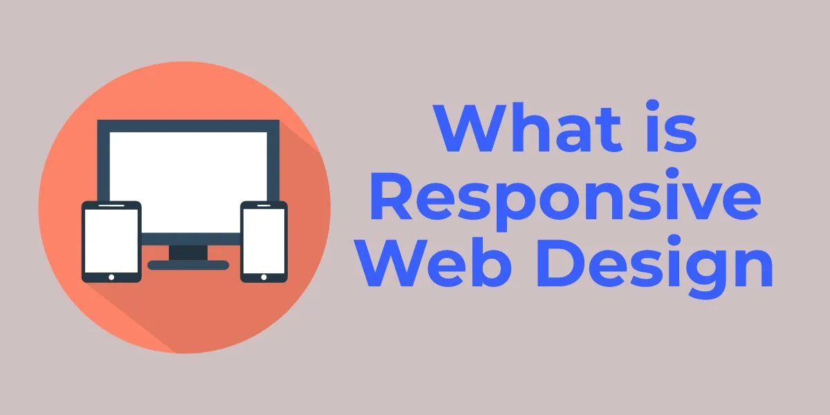
What is Responsive Web Design?
What is Responsive Web Design: Over the past few years, web design has been focusing on making mobile websites that put emphasis on text and remove a lot of the design elements from the full-size site. There are many advantages to designing a mobile version of your website.
Of course, as a large percentage of your potential visitors are now using a mobile device to find your business or website. So what is response web design, exactly? What can it do? Here’s a look at what responsive web design is and some key elements to look for in a well designed website.
Responsive Web Design
As most people won’t be viewing your small business web design on a desktop computer anymore. It’s now important for web designers to make a website that responds intuitively to the screen size of the viewer.
When people first began using their phones to browse the Internet. Designers began creating mobile versions of websites in addition to the full-size desktop version. It wasn’t too long before tablets, netbooks, laptops and phones were everywhere, with screen sizes both small and large.
To respond to this wide variety of screen sizes as well as resolutions. Designers came up with the idea of responsive web design, rather than creating a new version of the website for every device. One of the key elements of this type of web design is a fluid grid, or liquid layout.
Which is based on proportions rather than a specific number of pixels or a percentage. Using this fluid grid, the website automatically stretches to fit a large screen or squeezes down to fit onto a mobile phone browser.
Perhaps the biggest problem to address with mobile web design is the fact that it can remove advertising, as well as call-to-action buttons and your company’s signature brand. For truly effective responsive web design, it’s important that these elements remain intact no matter the screen size.
Responsive Design
Responsive web design (RWD) is the process of designing and developing websites that can adapt to any size display. Providing an optimized visual experience in each. There are several different methods used to achieve this, but the one consistent technology found throughout is CSS3 media queries.
It is important to note that depending on the context, the term “responsive” can be misleading. For example, the statement, “Your site utilizes responsive web design” is clear, however, “Your site is responsive” could also refer to the other meaning of the term “responsive”, referring to the speed at which a page loads, or how long it takes to complete an interaction once a button is clicked. For this reason, the term “adaptive” is sometimes a better adjective.
Important Elements of Responsive Web Design
There are some elements you should keep in mind to create a responsive web design that actually responds to the size of the browser to display content. A good web development company will use this method to improve website usability on any size screen. Here’s a look at some of the most important elements of responsive web design to create an effective and powerful mobile site.
Navigation:
You can lay out your site navigation in many ways depending on the width of the browser. Smartphone users may see navigation centered on the top. While those using a tablet will see the navigation on the top right corner.
Columns:
You can also use columns to change the display when a reader changes their browser size. Web design firms can create the website to be fully functional, no matter what type of device is used to view it. And they can effectively use columns as a tool.
A good example is when a user views a newspaper website on a mobile device. If the user reduces the size of their browser. It will automatically wrap the view around the text of the article remove images, ads and headlines.
Call to Action Buttons:
A good mobile web design will still incorporate the all important call to action button. Even the website is view on a small screen.
Business Branding:
One major issue that needs to be addressed is the branding and logo of the business when the website is viewed as a mobile version. Incorporate the branding at all sizes.. Many companies maintain their logo at the top of the mobile version with a text menu below for easy navigation.
If you’ve hired a web design firm that specializes in small business web design to create your unique business logo. Ask how they will incorporate it into the mobile version of your website.
Padding:
Finally, mobile web design should preserve the white space at every screen size to make sure content hierarchy is maintained while nothing feels crowded.
Websites in Smartphones
Now, certainly, all modern smartphones have the ability to allow users to browse the web regardless of how each site was built. For example, if you visit a website that lacks mobile optimization. It will scale to fit your device viewport and appear smaller.
You will still be able to view the content, but will have to pinch, zoom, and swipe to do so. This user experience has been acceptable in the past. However we are at a point now where it no longer is.
As you browse the web, I’m sure you’ve already noticed that more and more websites now have a mobile version. There was a time when not everyone had a website. Although today, it’s very rare to meet someone and find out their company doesn’t have one. Very soon, it will be the same for responsive design.
When you visit a site on your phone, it will surprise (and annoy) you if it is hard to read and you have to zoom, squint, and swipe to view the content you need.
Enhancing the Code
CSS3 and HTML5 media queries are languages that developers use to write the code of your website. Your browser reads these media queries and then presents them to you on the screen. There are several things a developer can do to create a completely custom code.
One notable feature is called @font-face. Which allows a browser to read a wide range of fonts, expanding the options available. But now, a developer can create a nearly endless array of custom fonts, making your website that much more unique.