Principles of Effective Web Navigation
Effective Web Navigation not only leads you to your desired destination, but it also offer a seamless and hassle free experience. While some websites may be an exception, for the most part, sensible navigation is crucial for their success, as it keeps users engaged and prevents frustration. Simply put, good navigation is the key to unlocking a website’s potential.
Do you have a website design of your own handy? Let’s do something uncomfortable. Bring it up in a separate window, and keep it open as you read through this article. It’s time to put your own navigation under the microscope. We’ll make sure that you’re not losing potential visitors by disorienting and confusing them.
Ready? Let’s start by asking your site some fundamental questions.
Effective Web Navigation – The Big Questions
How much thought goes into choosing navigation style on your page layouts? Do you go with When talking about web usability, you’ll commonly hear that effective navigation should answer some fundamental questions from the user:
Where am I?
For the average visitor, this is question number one. It may only be a millisecond thought, but it’s necessary to orient yourself after following a link. One of the navigation’s foremost jobs is to offer an anchor across a site’s page to answer this question. If the navigation fails to orient the visitor, their confusion becomes a usability concern.
For those of you with a website open, does your navigation indicate the current page? The most common way to show location is by placing a marker next to the corresponding menu item or highlight it with different colors.
Repetition works wonders. Picture the navigation area as its own page for a moment. Even though a page might have a title, it’s still a good idea to repeat this location with a graphical change to the navigation. Repetition works wonders.
Where have I been? – Breadcrumbs
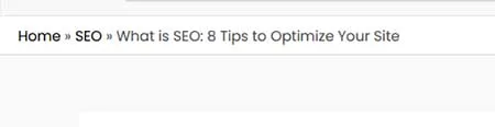
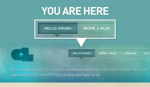
Fading visited links isn’t always only (or best) way to mark visited pages. Breadcrumbs do a remarkable job of quickly and simply orienting a visitor to their current location on a website. Wufoo makes good use of them throughout its tour pages:
With breadcrumb navigation, there isn’t much more effort required to add another tier of pages. It simply gets tacked to the end of the “crumb trail.” Typically, you wouldn’t want to design a site around this type of navigation alone. Breadcrumbs serve as a method of providing direction rather than serving as a guide for navigation. Use them as a secondary feature, but leave the primary navigation to something a little less dynamic.
Where can I go?
The user needs to know where they can go from the current location. This is especially important if the visitor is looking for something specific. Frustration is a surefire way to send someone away from your site.
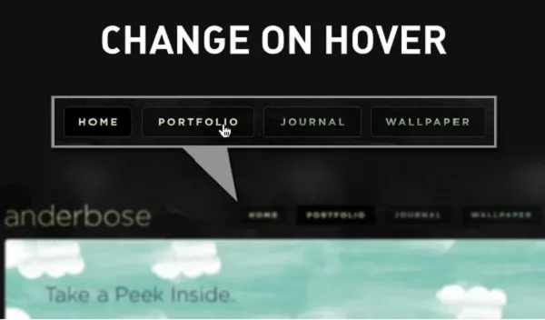
Changing a link’s style on hover is a popular way to show navigation items.
Why should I go there?
Simply giving the options is not always enough. Additional information on a menu item helps the user determine the contents of a page before following a link. This extra detail can come in the form of subtext or a tooltip on hover. It is there to add context to the menu item.
As Steve Krug writes in Don’t Make Me Think, usability does not always mean excessive explanation. As he points out, the average internet user no longer needs to be told to “Enter keywords here” in order to operate a search box. This is where standards and conventions come into play.
You don’t have to assume that users are new to the Internet. Keep this in mind when deciding what additional information to include.
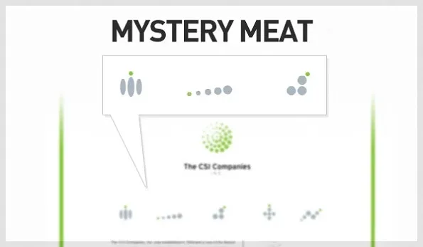
Effective Web Navigation – Avoid Mystery Meat
“Mystery Meat Navigation” describes a menu layout that is uncertain or unclear in its presentation. In the same way that a wheel is round, navigation design trends have evolved a certain way for a reason.With a mystery meat menu, the visitor has to orient themselves by guessing and experimenting with the design. There is no intuition or sense involved.
It’s possible to stick to conventions while still being creative, but this kind of navigation is far from either:
Effective Web Navigation – Conclusion
Take a moment to give your site one last look. Know that you have a few specific metrics in mind, how usable is your page? Are there any parts of your page that might need some extra clarification?
We’d love if you shared your findings in the comments below. Be honest! We’re not looking to call anyone out for poor design. In all fairness, even this blog doesn’t fit all of the usability guidelines laid out here.