Eye Catching Websites With Exceptional Navigation For Insight
Easy navigation defines a website as a magazine where people come in search of any sort of information. As there is a content list in a magazine in the same a website contains navigation. The content list presents an overview of the entire magazine. In the same way navigation also shows the visitor from the top what the website has for them. Both act like a pathway for their visitors and offer them the route for the magazine or the website.
Good and easy Navigation
The best Web Design could do for a website is to provide a good and easy navigation. Which makes the website a lot user friendly. The Website Design should be crafted in such a way that the moment a visitor lands on the website. They immediately get the idea of how to use it and what it is made for. To catch the visitor’s attention in the first go, one must smartly execute navigation as it is a very important factor.
1. Primary Navigation
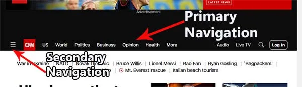
Primary navigation is the one which consists of the main menus or categories of the website. They are the main essential links that the visitor notice the moment the website loads. Common examples of primary navigation are Home, About Us, Contact Us and extra links depending on the kind of website you create for.
The primary navigation can accommodate a maximum of seven or eight links. A web designer has to select the most important links amongst all and put them on the main menu and place the other in the sub menu list.
2. Secondary Navigation
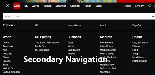
Secondary navigation can be known as the secondary links or the sub categories of the main menu. You can see it either from a drop-down menu or a fly-out menu.
When the user clicks on the menu button, they can find a drop-down menu list, which displays the submenu list.
On the other hand a Fly out menu is one when the user simply floats onto the menu button and the sub menu list appears. Here the user does not have to click on the main menu icon.
3. Position of Menus
Placing the menus should done very smartly. It is so because the visitor should be able to find them easily. Generally in horizontal navigation, it is displayed on the top just under the header of the website. On the other hand, a vertical navigation is placed completely on the left side of the website.
It is advisable to put your menus from left to right as people start reading from left. Which gives more probability for your visitor to notice your navigational panel in the first go.
4. Size of Buttons and Menu Label
The menu list should be of a size which is noticeable instantly. But don’t make it too large that it occupies a lot of space. Place them where visitors can easily see them while maintaining a professional look.
If you are setting menu labels, be sure that they are readable in size. Also select the font color in contrast with the color of the button. If the button is of light color than use dark color for your menu label and opposite is also true.
5. Color of Menu Buttons
Colors play a very important role in tempting the visitors immediately. The color of your menu icon should be in contrast with that of your background. This way it will attract the visitors and the icons will stand out with the different factors of the website.
6. Icons and Effects
Icons are of great help to attract viewer’s attention. It also gives the viewer a brief idea about that particular link. People are also attract to the hover effect. This also makes the visitor click on the icon which they find unique and interesting. You can even insert a button-click effect to notify your viewers on which button they clicked.
And the last tip for you is-
7. The less click, the better.
Visitors are generally in hurry when seeking any information. They want to reach to the desired results as soon as possible. Make your navigation wisely so that visitors don’t take too long to reach the preferred result.
A very useful tip is to ensure that every page of yours can reach within three clicks. Following this suggestion will help you to make your visitor stay longer on the page.
Bottom Line:
It is of no use to have a very beautiful and attractive Web Design till the time your user is not able to navigate around in search of the information they are looking for. The best way to make your navigation effective is by keeping it simple and obvious. This way you will keep your visitors coming back to your site again and again. Be certain that your visitors are capable to find the necessary information instantly, rather than searching during masses of extra information. Your navigation should be effortless for the user and assist the user to locate the information conveniently.