Optimize Call to Action Buttons. Website design is both an art and science. There are plenty of designers who will go one step further and say that it is more science than art. Today, the focus of website designers has partially shifted from visual appeal to encouraging better conversions. There is no doubt that website design needs to be visually appealing.
But what is even more important is that this design encourages a positive response from website visitors. To do that, you need to change the perception of a person. And this is why there is also a bit of science involved in website design.
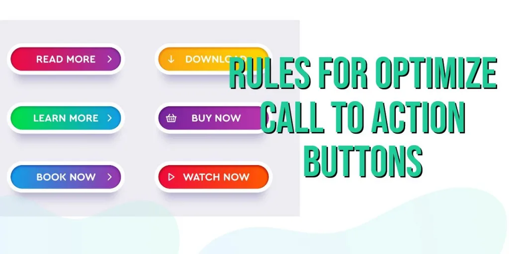
Call to Action buttons
This is the also the point where the ‘Call to Action’ buttons come into play. In the parlance of website designing, these are design elements that encourage a user to take action. The use of these buttons is not new and is as old as website designing itself. But, with websites emerging as big players in the battle to win the attention of target customers.
The ‘call-to-action’ buttons have begun playing a more significant role in improving a website conversion count. So, it makes sense that the use of these buttons (usually appearing as clickable elements) is optimized so much. So that action is guaranteed from their use.
Effective call-to-action buttons that grab the user’s attention and lure them into clicking them are the need of the hour. And it’s only by using effective designing techniques that this can be made possible. Let’s take a look at 4 rules, which can help optimize call-to-action buttons
Optimize Call to Action Buttons – Size Still Matters
It’s the simple things that you need to do right. The size of a page element with respect to other design elements of the page does matter. So, if your call-to-action button is relatively larger as compared to other page elements, it is sure to grab a user’s attention. There are designers who choose to create a call-to-action button whose size is larger than the logo on the site. This way, they can place them higher on the web page, and they will still command attention.
So, here’s the first Golden Rule – Ensure that your call-to-action button has a size that is larger than its surrounding elements.
Prominent Placement
Position your call-to-action button/s in a way such that they are immediately visible to website visitors. Identify the prominent positions on your web page and place your button in these positions. This will help them draw more user attention. Which leads to higher landing page conversions. One of the best positions is right at the top of the web page. Here, there is very little chance that the button will be ignored.
Another great positioning will be right at the center of the layout. While doing so, you must ensure that there are no other designing elements around the call-to-action button that can distract the user. Yet another way that you can make sure your call –to-action buttons have pride of place is by positioning them in a manner that makes them appear to be on top of other elements on the page. This can be done by placing them on a ‘distinguished area’.
The Second Golden Rule – Proper placement is the key to a successful call-to-action button.
Color Contrasts
Color and Call-to-Action buttons, does it really matter what color you choose for your buttons? Yes, it does and it matters a great deal. Remember, the idea is to draw attention to these buttons and what could be better than choosing the right color. Or to put it specifically, zeroing in on the right color contrasts. Now, this use of contrasting color must keep the color of the surrounding elements and background of the webpage in mind.
For e.g. if most of the design elements that appear on a web page are blue. Orange will provide the best color contrast here. When it comes to the use of color contrast it is not just important to draw attention with it. But you must also ensure that it goes well with the design of the webpage.
The Third Golden Rule – Use call-to-action buttons with color that contrasts with the surrounding elements and background of the web page.
Insistence and Persuasiveness
Your call-to-action buttons must be such that users respond to them with a sense of urgency. For this to happen, they must appear insistent and persuasive at the same time. They must be able to hasten the users’ decision to click on the button. The perception created by the button must be such that the users must feel that they are missing out on something big, if they don’t take action.
Something as simple as a button that proclaims “Buy now” in big bold letters conveys a sense of urgency. It suggests that if you don’t buy now, you might be losing out on a profitable opportunity. The keywords here are ‘Now, ‘Right Now’ and ‘immediately’ and while they might sound a little loud. Their inherent power to insist and persuade cannot be denied.
The Fourth Golden Rule – Use Words in your Call to Action Button that Express Immediacy
Conclusion
It’s important to note that golden rules only work if you are really serious about optimizing these buttons for better conversions. In professional website design, there are no half measures and you either going the whole hog or you don’t go anywhere.
Be very careful about the golden rule that you are going to follow. And incorporate it after a lot of forethought and with an eye on its qualitative objective. The best thing to do is create a call-to action button that is a coming together of all the rules.